
React - Material UI Theme Integration

 28.12.2022
Greetings, dear Techcareer.net! 😊
In this article, I would like to provide you with information on integrating Material UI into a React project and how to style the UI Kit. By integrating Material UI theme into your React project, you can create various types of themes such as blog themes, e-commerce themes, and any other themes you can think of. I will be following the design system called "material" by Google and continue using the "mui" library, which is quite popular among interface libraries for React.
Creating a React Project
Firstly, let's create a new React project. If you are new to the React world, you can learn how to start a new project from the link below:
https://tr.reactjs.org/docs/create-a-new-react-app.html
npx create-react-app mui-demoIntegration of Material UI Library into the Project
After creating our project by entering the above command into the command line, let's include the Material UI library in our project. To do this, we can open the main directory of our project in the command line and apply the following command. This way, we include the Mui library and the necessary packages into our project.
npm install @mui/material @emotion/react @emotion/styled
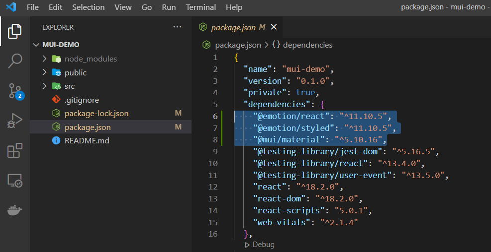
To ensure that the packages are installed correctly, you can check whether the following packages are included in the "package.json" file. The version numbers may vary when you install them.
Calling Material UI Components with Code
Now that we have created our React project and included the Mui library in it, we can move on to the coding part. To do this, let's first modify the content of the "App.js" file under the "src" folder as follows. Although I am demonstrating it through the "App.js" file, you can apply this in any file or component you prefer. In the code below, we are calling various Mui components. We will first examine how they appear in their default state. Then, we will apply our own theme styling and observe the result.
import { Container, Typography, Grid, Button, Alert } from "@mui/material";

function App() {
	return (
		<Container>
			<Grid container>
				<Grid item xs={12}>
					<Typography variant="h1" component="h1">
						Bu bir başlıktır
					</Typography>
					<Typography variant="h2" component="h2">
						Bu bir alt başlıktır
					</Typography>
					<Typography variant="body1" component="p">
						Bu bir açıklama yazısıdır
					</Typography>
					<br />
					<Button variant="contained" color="primary">Primary Button</Button>
					<br /><br />
					<Button variant="contained" color="secondary">Secondary Button</Button>
					<br /><br />
					<Alert variant="outlined" severity="success">
						Success component
					</Alert>
					<br/>
					<Alert variant="outlined" severity="error">
						Error component
					</Alert>
					<br />
					<Alert variant="outlined" severity="warning">
						Warning component
					</Alert>
					<br />
					<Alert variant="outlined" severity="info">
						Info component
					</Alert>
				</Grid>
			</Grid>
		</Container>
	);
}

export default App;
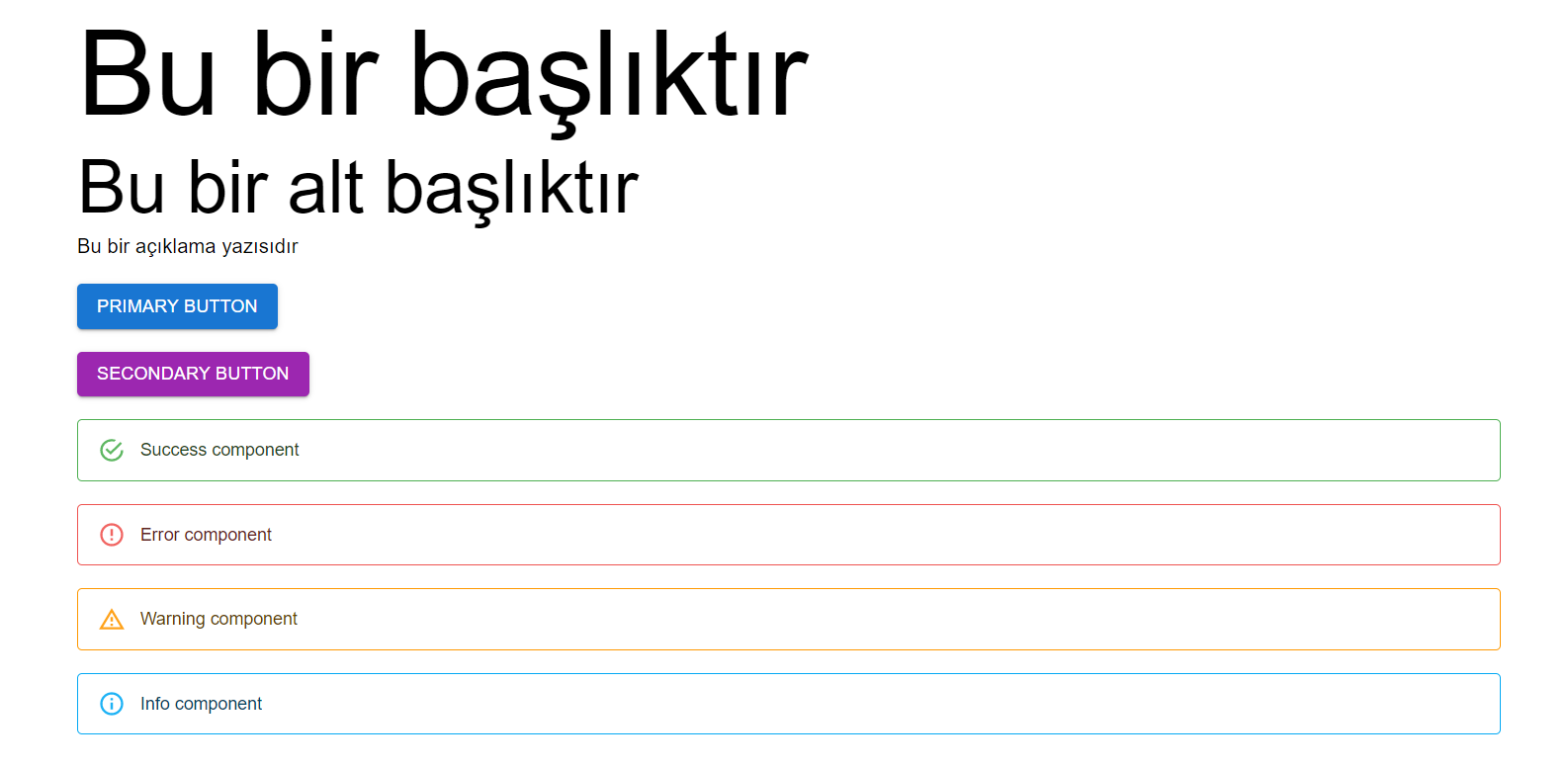
In the code above, I created a layout using the <Container> and <Grid> components and added a title, a subtitle, two buttons, and four alert components to this layout. We will work with the components we added between the <Grid> tags. First, let's examine how the code output looks with Mui's default settings. The output with default settings will appear as follows.
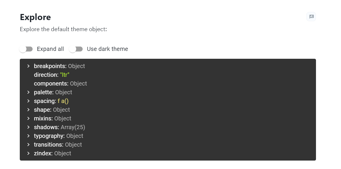
Now we come to the important part. In the continuation of the article, we will make global changes to the components we previously called within App.js. First, I kindly request you to visit the following link. In this link, you will see Mui's default theme tree. We will define colors, typography, and all other properties using the properties in this tree. Since changing all properties in the tree would take a long time, I will explain it using some properties. Afterward, once you understand the logic, you can make changes to other properties on your own.
https://mui.com/material-ui/customization/default-theme/
Now let's return to the code side. Under the "src" folder of our project, let's create a file named "theme.js" and modify its content as follows.
import { createTheme } from '@mui/material/styles';

// İlk kısım
let theme = createTheme({
	palette: {
		primary: {
			main: "#3F51B5",
		},
		secondary: {
			main: "#FF5722",
		},
		text: {
			primary: "#212121",
			secondary: "#757575",
		},
		success: {
			main: "#4CAF50",
		},
		error: {
			main: "#FF5252",
		},
		info: {
			main: "#2196F3",
		},
		warning: {
			main: "#FFC107",
		}
	},
	typography: {
		fontFamily: "Arial",
		body1: {
			fontSize: "1rem",
		},
		body2: {
			fontSize: "0.875rem",
		},
		h1: {
			fontSize: "3.5rem",
			fontWeight: 500,
		},
		h2: {
			fontSize: "2.5rem",
			fontWeight: 300,
		},
	},
});

// İkinci kısım
theme = createTheme(theme, {
	components: {
		MuiButton: {
			styleOverrides: {
				root: {
					borderRadius: 10,
				},
				containedPrimary: {
					border: "3px dashed",
					"&:hover": {
						borderStyle: "solid"
					}
				},
			},
		},
		MuiAlert: {
			styleOverrides: {
				outlined: {
					border: "2px solid",
					borderLeftWidth: 10,
					borderRadius: 10,
				},
				outlinedInfo: {
					borderColor: theme.palette.info.main,
					color: theme.palette.info.main
				},
				outlinedSuccess: {
					borderColor: theme.palette.success.main,
					color: theme.palette.success.main
				},
				outlinedError: {
					borderColor: theme.palette.error.main,
					color: theme.palette.error.main
				},
				outlinedWarning: {
					borderColor: theme.palette.warning.main,
					color: theme.palette.warning.main
				},
			},
		},
	},
});

export default theme;
As you can see, we have created a new theme file with our own values, taking examples from the Mui default theme tree that I mentioned earlier. In the theme file, I provided examples from the color palette and typography properties, but you can change all of them by examining the properties in the default theme. For example, in the palette, I only changed the main colors, but you can also define colors like light, dark, etc.
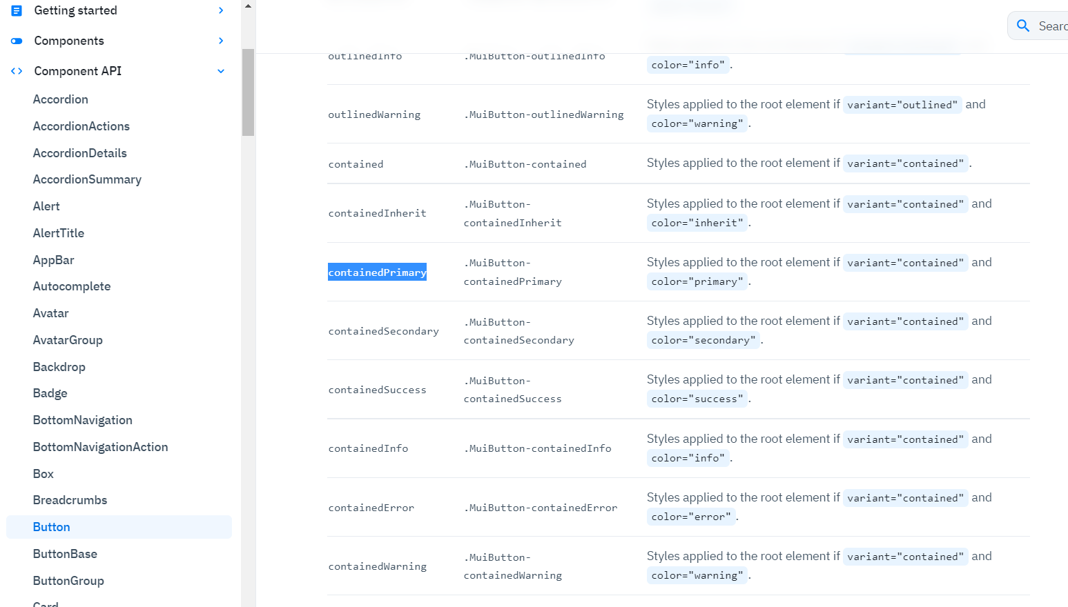
The code block where the "theme" variable is reassigned and contains the "components" property is quite important. Within the "components" property, we can modify the properties of Mui components using the Mui API. For example, in the example, there is another property called "containedPrimary" within the "MuiButton" property, and it has defined style properties. This means: "Select the button with the variant property set to contained and the color property set to primary." The button with these properties is included in our code within App.js and takes on the style properties we have defined. The property specified as "root" indicates that it should be applied to all button components. Thus, all buttons have the "borderRadius" property defined.
Now you may be wondering, "Where can we access these properties like MuiButton, containedPrimary?" When you click on the desired option under the Component API in the Mui documentation, the relevant properties will be presented to you under the CSS section.
Before we examine the final appearance, there is one more step we need to take. We need to distribute the theme we created to the React components so that our application can use the theme we defined. We can achieve this by wrapping our application with the ThemeProvider provided by Mui.
Let's go to the "index.js" file under the "src" folder of our project and modify it as follows. Essentially, what we're doing here is wrapping the <App /> component with ThemeProvider. We indicate that ThemeProvider should use our previously coded theme file with "theme={theme}".
import React from 'react';
import ReactDOM from 'react-dom/client';
import App from './App';
import { ThemeProvider } from '@mui/material/styles';
import theme from './theme'

const root = ReactDOM.createRoot(document.getElementById('root'));
root.render(
	<React.StrictMode>
		<ThemeProvider theme={theme}>
			<App />
		</ThemeProvider>
	</React.StrictMode>
);
We can now view the final version of our application:
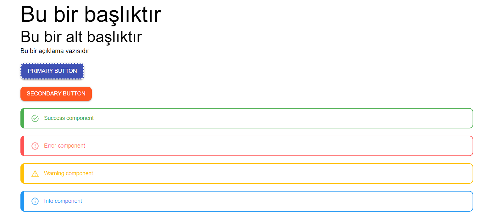
- In comparison to the initial state of the application, we can list the visual changes as follows:
- Typography properties have been defined, resulting in smaller H1 and H2 headings.
- The palette property has changed the primary, secondary, success, error, info, and warning colors.
- The corners of buttons in all variants have been rounded.
- Buttons with the "variant=contained" and "color=primary" properties have a 3px dashed border. When hovering over the button, the dashed style changes to solid.
- Alert components with the "variant=outlined" property have a 2px solid border, with the left border width set to 10px. The corners have been rounded.
- For Alert components with the "variant=outlined" property, different content and border colors have been defined for "success," "error," "info," and "warning" states.
Final:
In this article, I have attempted to explain how to style a UI Kit in the Mui library for the purpose of basic setup. In a real-world application, your theme file will have more properties. Therefore, I recommend visiting the Mui documentation frequently to familiarize yourself with the properties. The methods described here are based on version 5.10 of the Mui library. The approaches may vary in future versions. You may also come across different approaches from various sources online when implementing the above steps. The important point is to create a scalable UI structure using the information you gather from different sources.
Thank you for your time. 😊


